-
February 02, 2017
Van Gogh in images on Wikipedia
I’m a love the art of Vincent Van Gogh since I was little. I like his color palette and how he interprets his surrounding environment. With this project, I got the chance to learn more about his life and work.
Lionel Michel showed me his project Geolinguistic Contrasts in Wikipedia. I liked the idea to take one wikipedia article and to compare the different language versions. It is interesting to see their similarities and differences.
First exploration
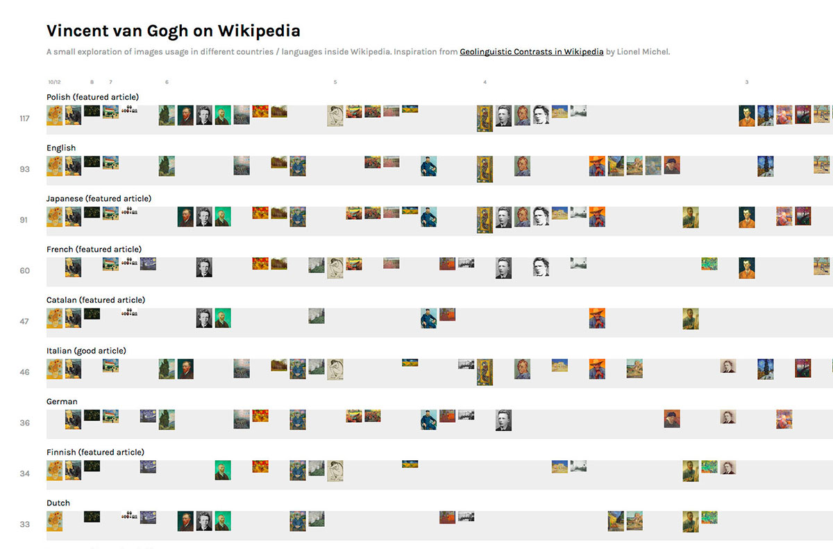
I started the project by gathering interesting data from Wikipedia. Wikipedia has a great API, that makes it easy to use their data. I downloaded all images from four different languages to get a better understanding of the data.
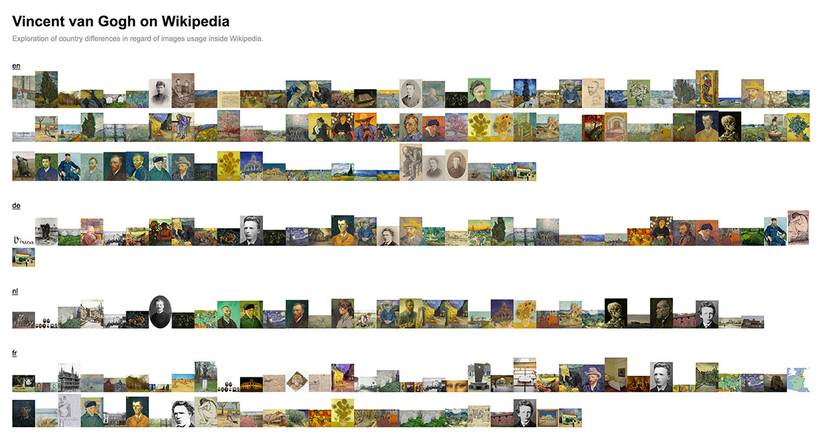
The first exploration is quite simple. It demands for a kind of sorting or clustering to see similarities between languages.
Refined first exploration
The refined version makes it easier to spot the most used images, but it still misses the bigger picture.
Second exploration
I tried to find more data for the next exploration. I used the api again to scrape most of the image ages. I also added manually the authorship and the category of the images to get a better understanding how different languages select their images.
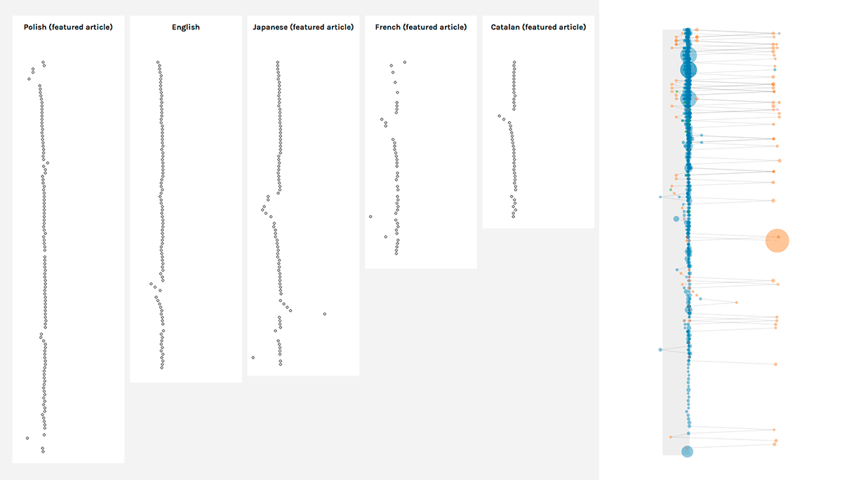
Those are the first prototypes how the collected data looked like. I tried different ways to represent the data. Here you can see it side by side as well as together. I decided to go with the first approach to make it more readable. Both version reminded me on music notes. I thought about flipping them by 90 degrees to get even closer to the notes, but I decided against it to represent the flow of the page in the right way.
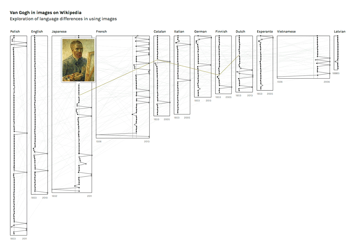
I refined the first prototype and made the whole visualization more compact. I also thought about connecting all images between different languages, but it made the visualization too noisy.
The last version
The last version, but not the final. I guess it would need more time and feedback to make the visualization more useful for others.
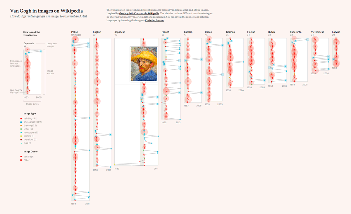
The visualization growed over the time. It shows the year, category and the number of occurrences of each image. The reader can see the connections between the languages through the images via mouse over.
Learnings
After a long break from visualizing data, I started the project out of curiosity for the topic and to get back to data viz. It is nice to create something for your self, but the missing of a real target audience makes it less interesting for others.
From a development perspective: I tried to avoid any additional Javascript framework to keep it simple for the beginning. I guess, I have to invest more time in structuring the code in the next projects.
-
June 12, 2016
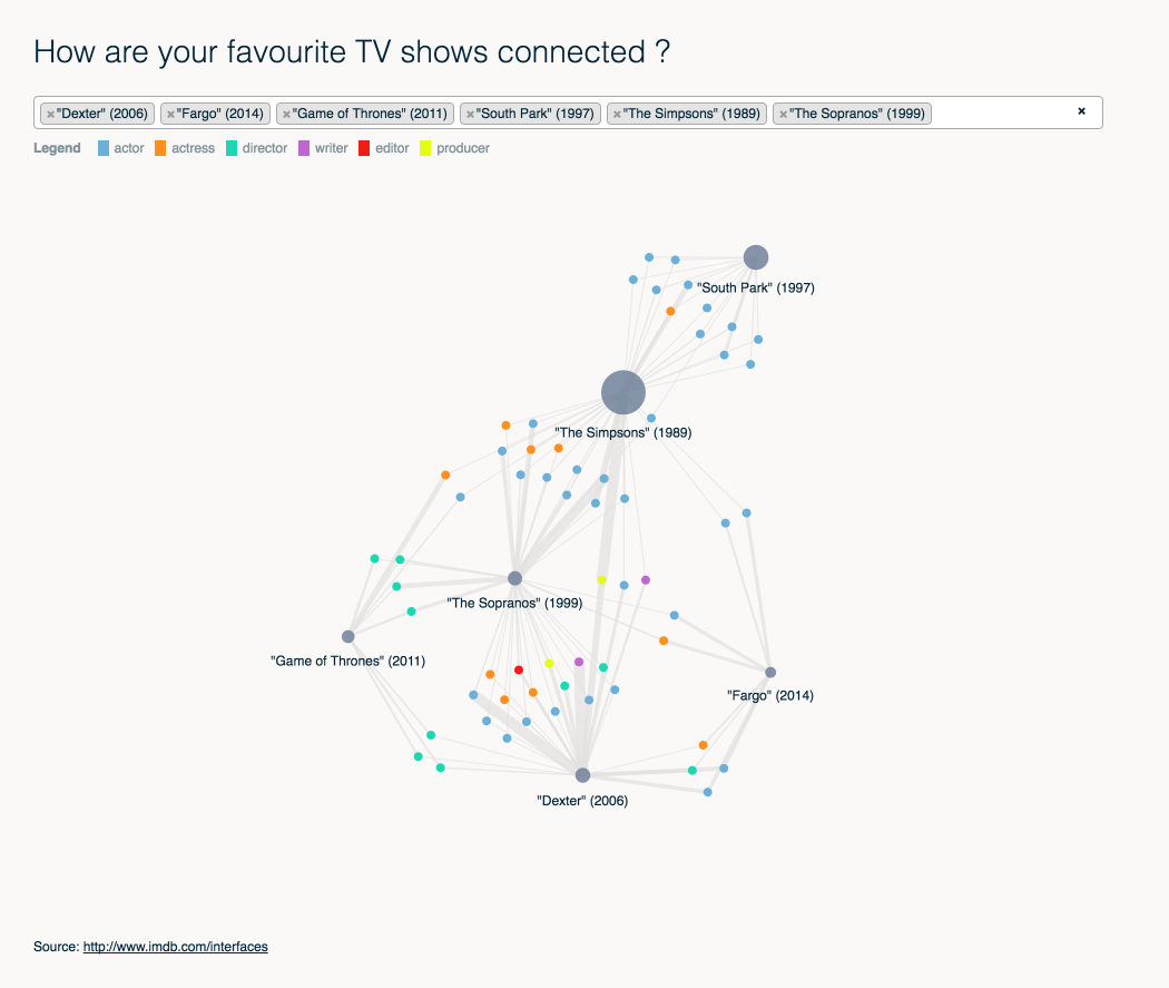
How are your favourite TV shows connected ?
-
June 05, 2016
The diversity of career paths of oscar winners
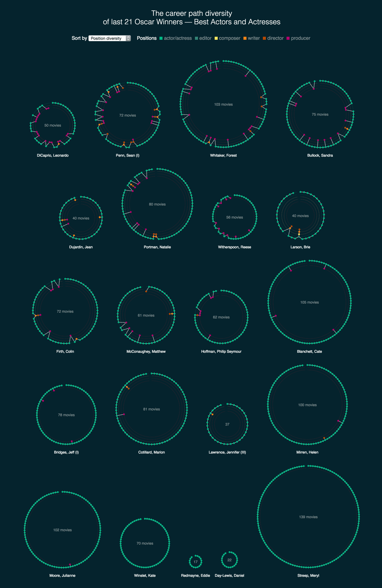
The imdb dataset is rich of interesting data to play with. This time I had a look at the diversity of career paths of actors and actresses.
I learned about Simpson-Index that scientists use to measure diversity in data sets. It was quiet interesting to compare the visual output with that single index. The index alone is quiet handy to find actors/actresses or sort them by diversity. The visualisation on the other side show more about pattern and how people evolved through the years.
-
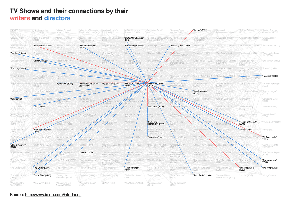
After watching a tv show, I’ve got interested how the production of the tv shows works. I downloaded a dataset from IMDB and started to explore the data. Here you can see two different views on the connection between different show through their writers and directors.
List
Network
 It is interesting to see that both visualisations have their own purpose.
 -
February 13, 2016
The wealth of the world #2
I followed up the findings from the last experiment, that shows the difference between the distribution of wealth. I looked for other ways to visualize that. I guess the easiest way would be to show ratio of wealth per adult of a country. Unfortunately I think this solution doesn’t show the contrast between the rich and poor in the right relation.
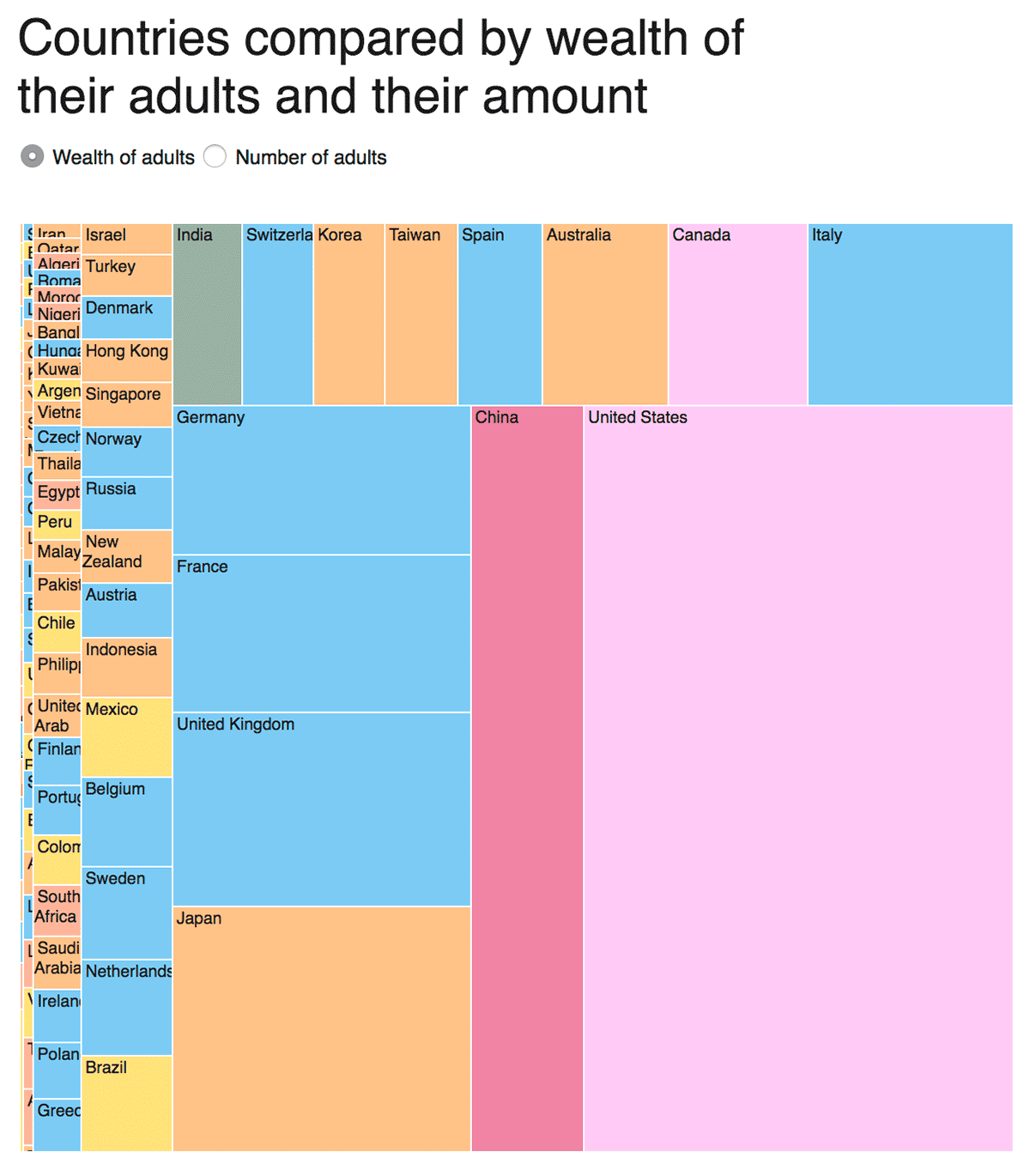
The first graph shows the distribution of wealth in the whole world and the amount of adults per country. It is interesting to see how the distribution changes by switching from wealth to adults. The drawback of this visualization is that the reader has to memorize the former position. Furthermore the reader can’t see poorer countries because of their size.
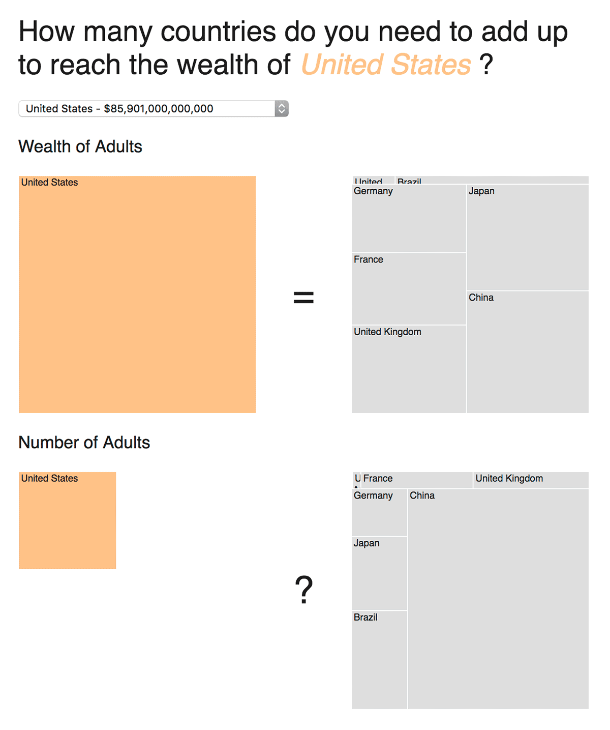
The second graph tries to improve those disadvantages. The reader can select a country. The graph shows the wealth of the selected country on the left side. On the right side the reader sees how many other countries you would need to reach the same amount. And now it becomes interesting: Underneath the wealth you can see the amount of adults. On the left you see the selected country vs the added up ones on the right . It is easier to see the differences now, but the areas of the treemap still makes it too hard to compare the countries.
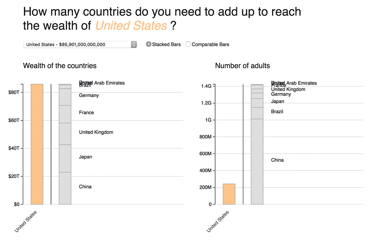
The third graph shows the same information like the previous one. It is now easier to compare the different countries, but it misses on elegance. I liked the second approach, but it is still hard to read. I guess the purpose of the graph should decide which one I should pick.
-
January 30, 2016
The wealth of the world
Oxfam published an article that the world 62 richest people own the same wealth as the 3.6 billion poorest people. Those two numbers made me curious. I downloaded Credit Suisse’s The Global Wealth Databook 2015 and scraped the Forbes Billionaires List. It was not so easy to get to the same results as Oxfam. So I decided to only concentrate on the wealth of the countries and their differences to each others.
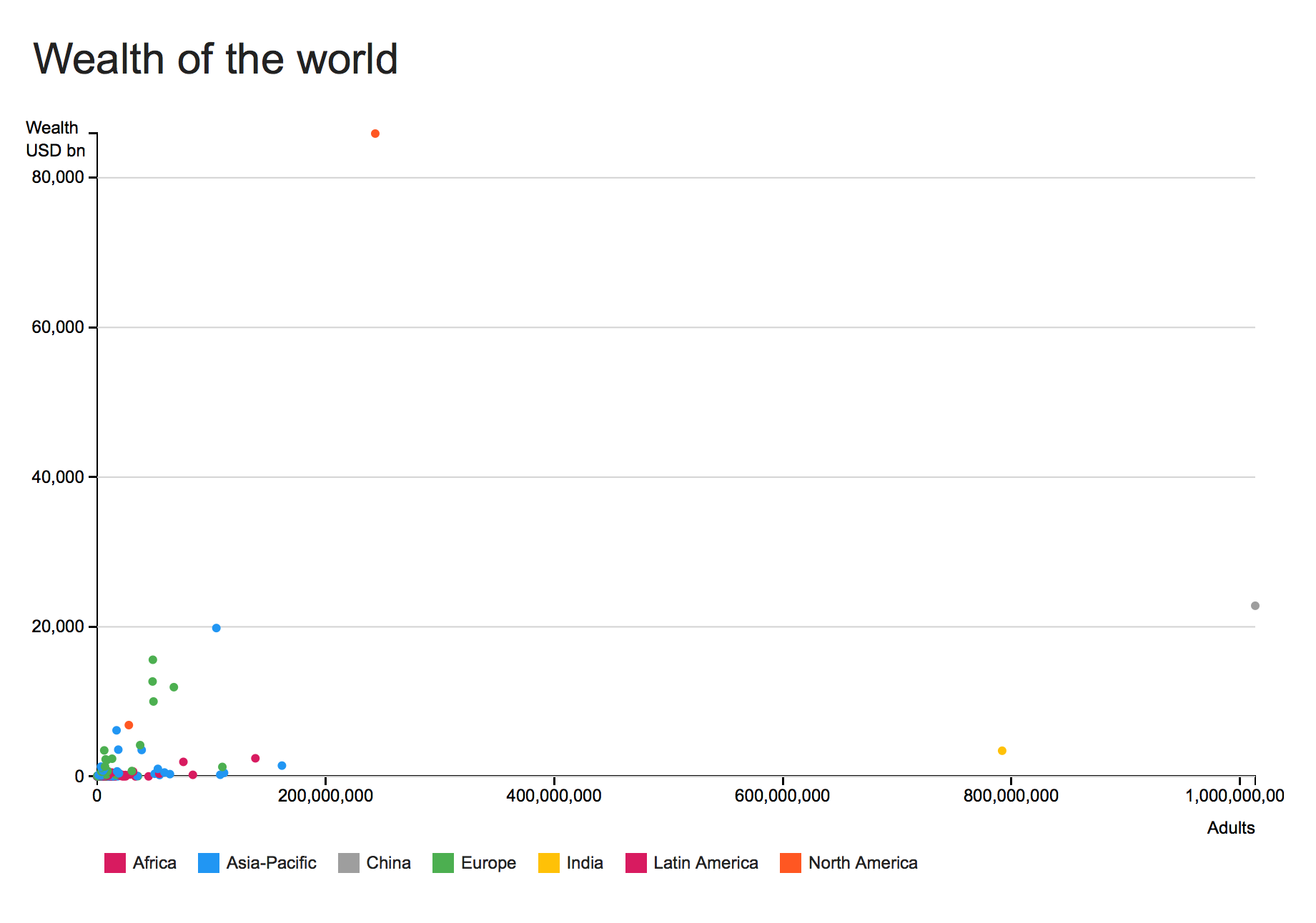
The first chart shows the wealth of the countries and the amount of adults per country. The outcome isn’t stunning. Most of the countries are in the left corner and overlapping each other. The big outliers are China and India, but you can’t see anything new.
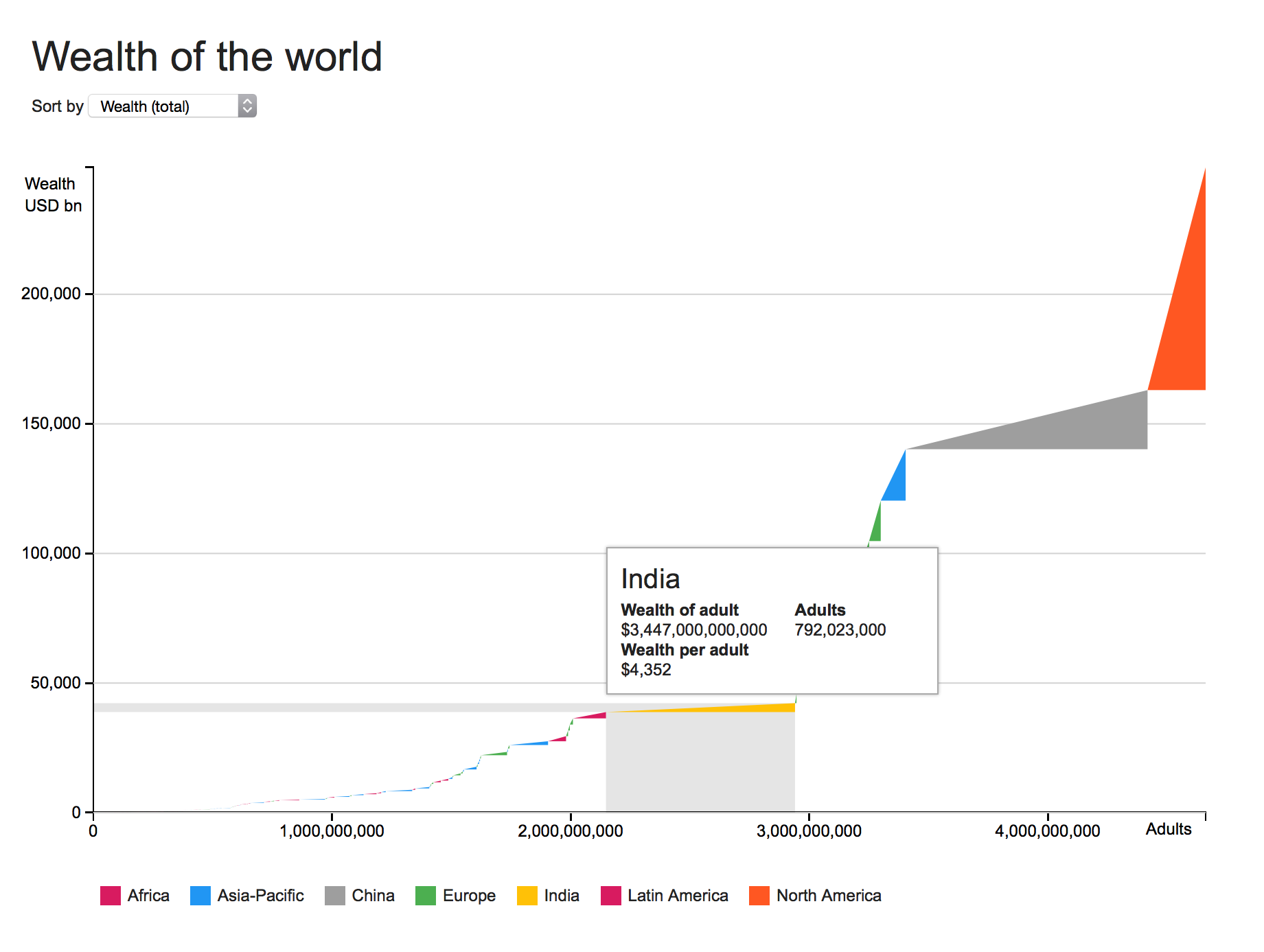
The second chart shows the same information in a different way. It is maybe not the right way to show it, but is helps me to spot some findings. The chart adds up all countries and their adults. Each triangle represents a country and the form of the triangle the relation of wealth and adults. You can see India with a huge amount of adults, but with a smaller wealth than for example Switzerland.
