Van Gogh in images on Wikipedia
I’m a love the art of Vincent Van Gogh since I was little. I like his color palette and how he interprets his surrounding environment. With this project, I got the chance to learn more about his life and work.
Lionel Michel showed me his project Geolinguistic Contrasts in Wikipedia. I liked the idea to take one wikipedia article and to compare the different language versions. It is interesting to see their similarities and differences.
First exploration
I started the project by gathering interesting data from Wikipedia. Wikipedia has a great API, that makes it easy to use their data. I downloaded all images from four different languages to get a better understanding of the data.
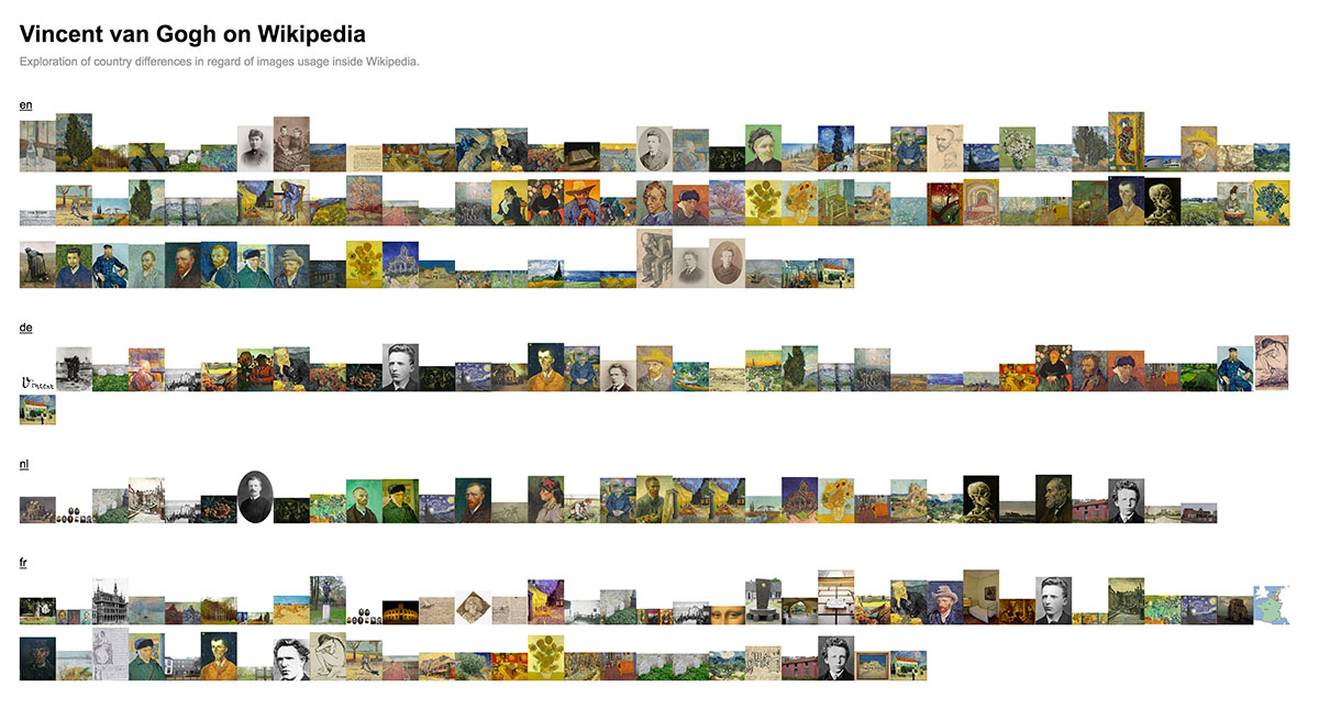
The first exploration is quite simple. It demands for a kind of sorting or clustering to see similarities between languages.
Refined first exploration
The refined version makes it easier to spot the most used images, but it still misses the bigger picture.
Second exploration
I tried to find more data for the next exploration. I used the api again to scrape most of the image ages. I also added manually the authorship and the category of the images to get a better understanding how different languages select their images.
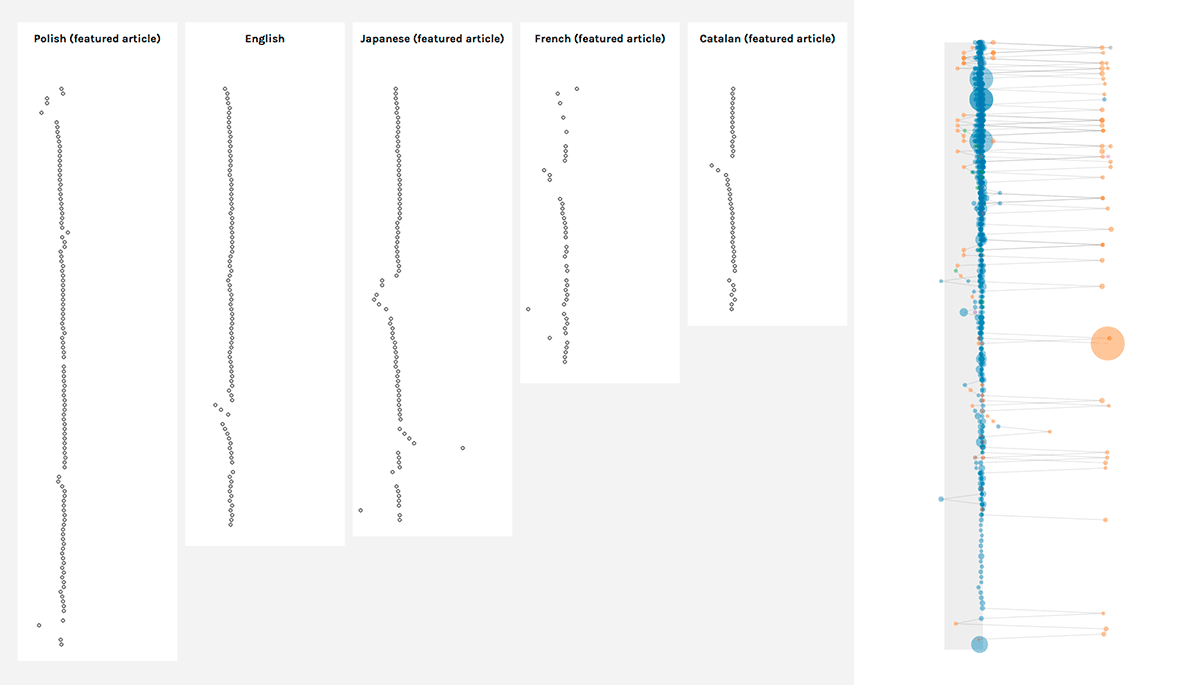
Those are the first prototypes how the collected data looked like. I tried different ways to represent the data. Here you can see it side by side as well as together. I decided to go with the first approach to make it more readable. Both version reminded me on music notes. I thought about flipping them by 90 degrees to get even closer to the notes, but I decided against it to represent the flow of the page in the right way.
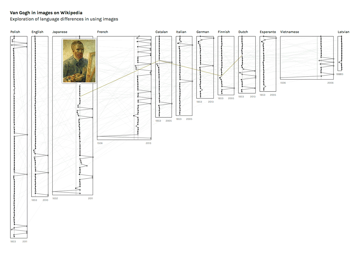
I refined the first prototype and made the whole visualization more compact. I also thought about connecting all images between different languages, but it made the visualization too noisy.
The last version
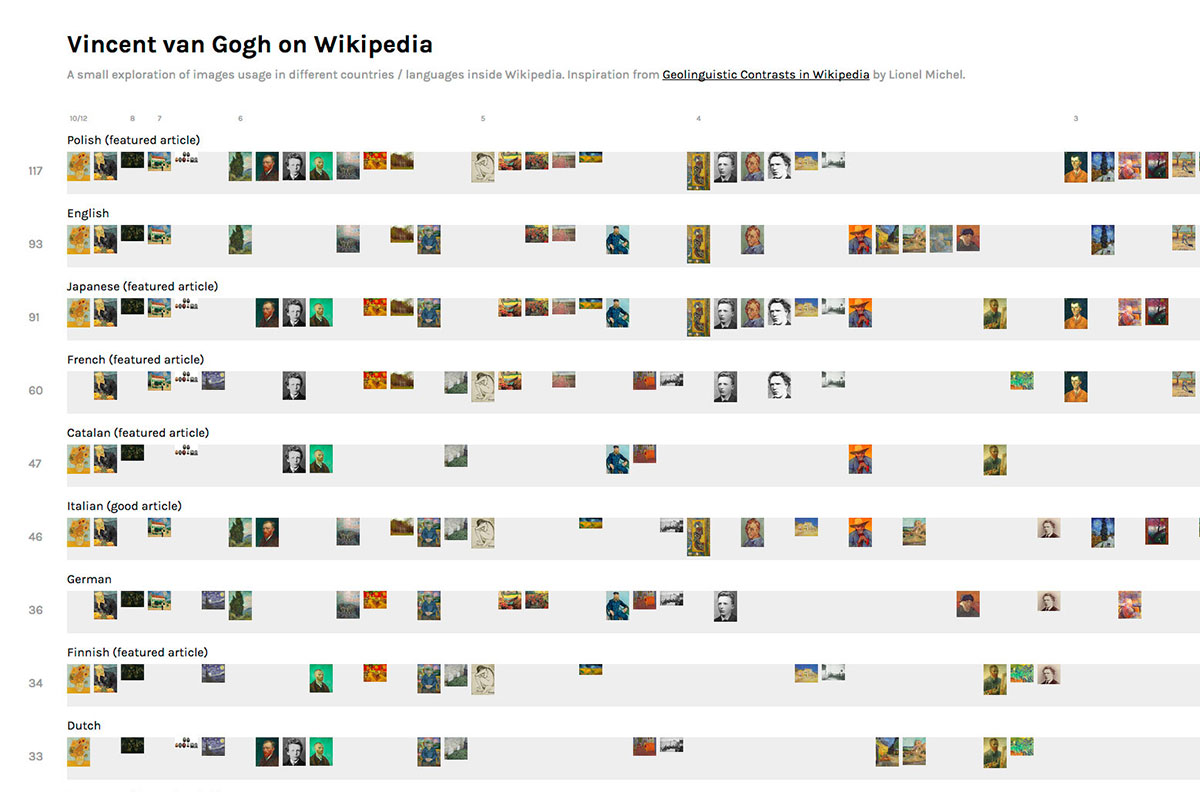
The last version, but not the final. I guess it would need more time and feedback to make the visualization more useful for others.
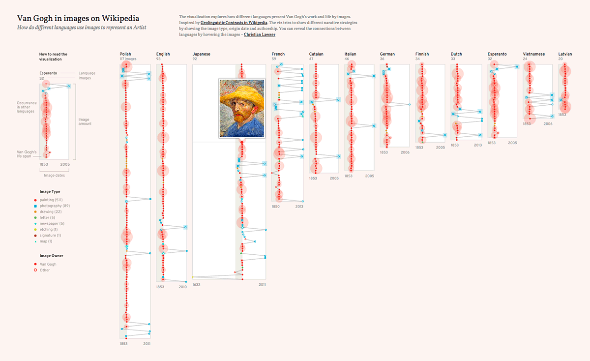
The visualization growed over the time. It shows the year, category and the number of occurrences of each image. The reader can see the connections between the languages through the images via mouse over.
Learnings
After a long break from visualizing data, I started the project out of curiosity for the topic and to get back to data viz. It is nice to create something for your self, but the missing of a real target audience makes it less interesting for others.
From a development perspective: I tried to avoid any additional Javascript framework to keep it simple for the beginning. I guess, I have to invest more time in structuring the code in the next projects.
