The wealth of the world #2
I followed up the findings from the last experiment, that shows the difference between the distribution of wealth. I looked for other ways to visualize that. I guess the easiest way would be to show ratio of wealth per adult of a country. Unfortunately I think this solution doesn’t show the contrast between the rich and poor in the right relation.
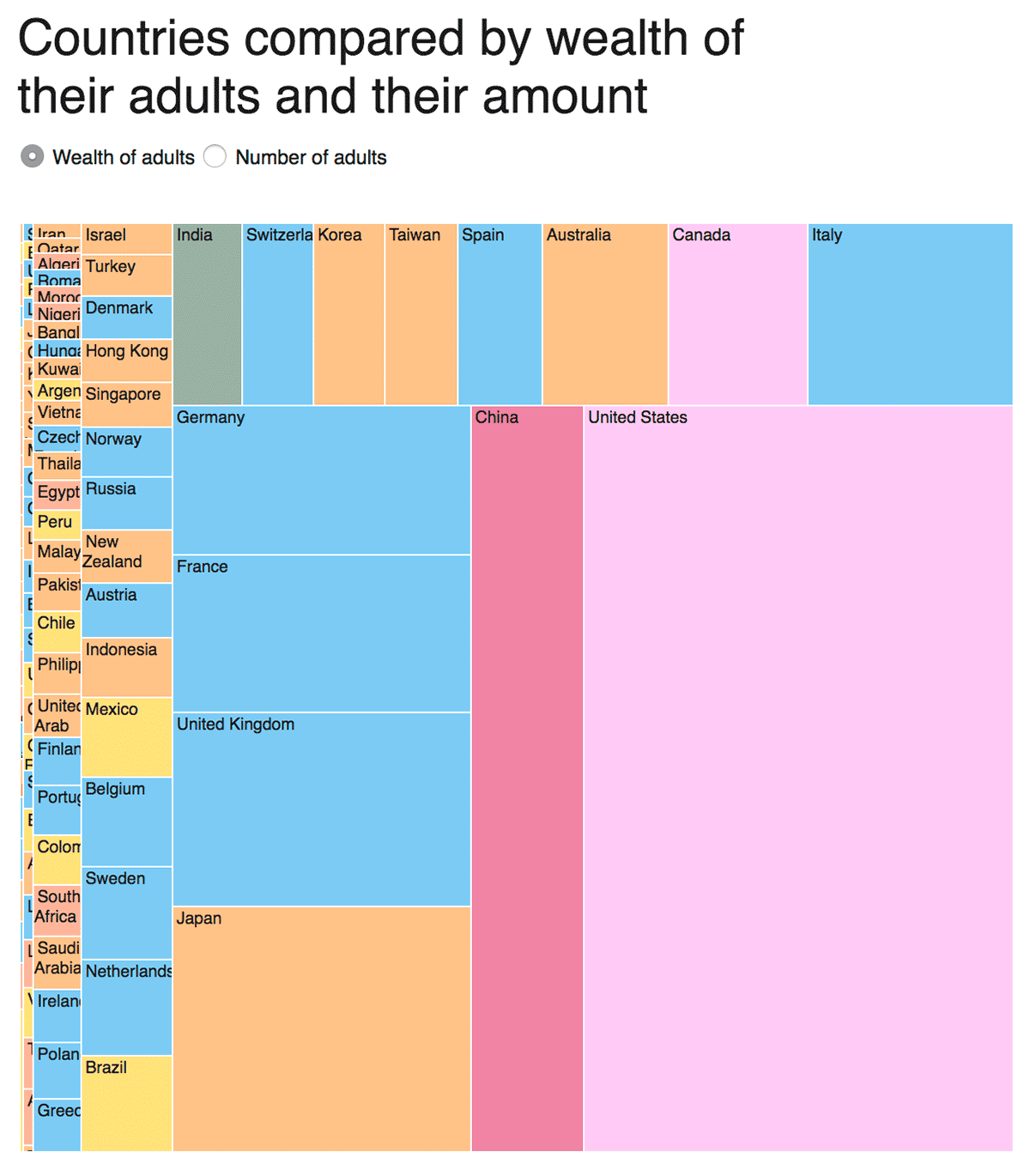
The first graph shows the distribution of wealth in the whole world and the amount of adults per country. It is interesting to see how the distribution changes by switching from wealth to adults. The drawback of this visualization is that the reader has to memorize the former position. Furthermore the reader can’t see poorer countries because of their size.
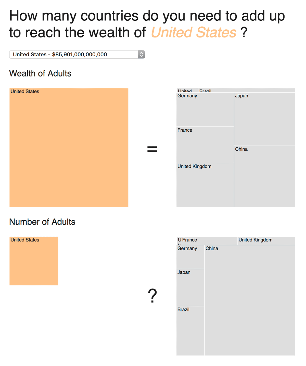
The second graph tries to improve those disadvantages. The reader can select a country. The graph shows the wealth of the selected country on the left side. On the right side the reader sees how many other countries you would need to reach the same amount. And now it becomes interesting: Underneath the wealth you can see the amount of adults. On the left you see the selected country vs the added up ones on the right . It is easier to see the differences now, but the areas of the treemap still makes it too hard to compare the countries.
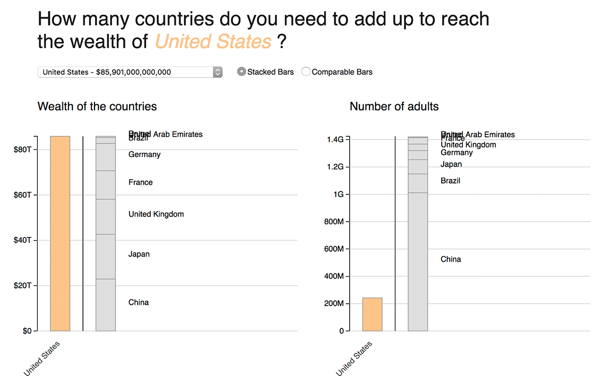
The third graph shows the same information like the previous one. It is now easier to compare the different countries, but it misses on elegance. I liked the second approach, but it is still hard to read. I guess the purpose of the graph should decide which one I should pick.


