The wealth of the world
Oxfam published an article that the world 62 richest people own the same wealth as the 3.6 billion poorest people. Those two numbers made me curious. I downloaded Credit Suisse’s The Global Wealth Databook 2015 and scraped the Forbes Billionaires List. It was not so easy to get to the same results as Oxfam. So I decided to only concentrate on the wealth of the countries and their differences to each others.

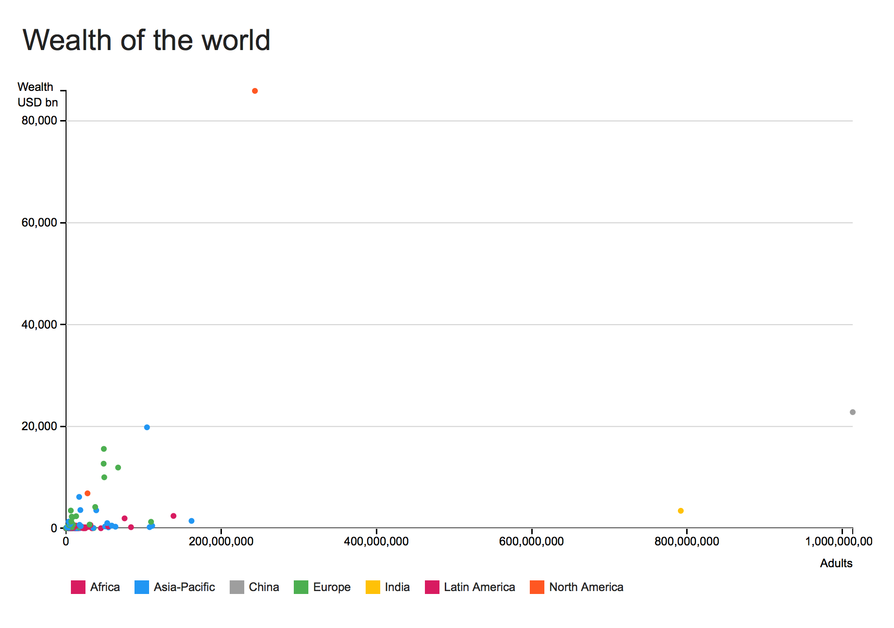
The first chart shows the wealth of the countries and the amount of adults per country. The outcome isn’t stunning. Most of the countries are in the left corner and overlapping each other. The big outliers are China and India, but you can’t see anything new.
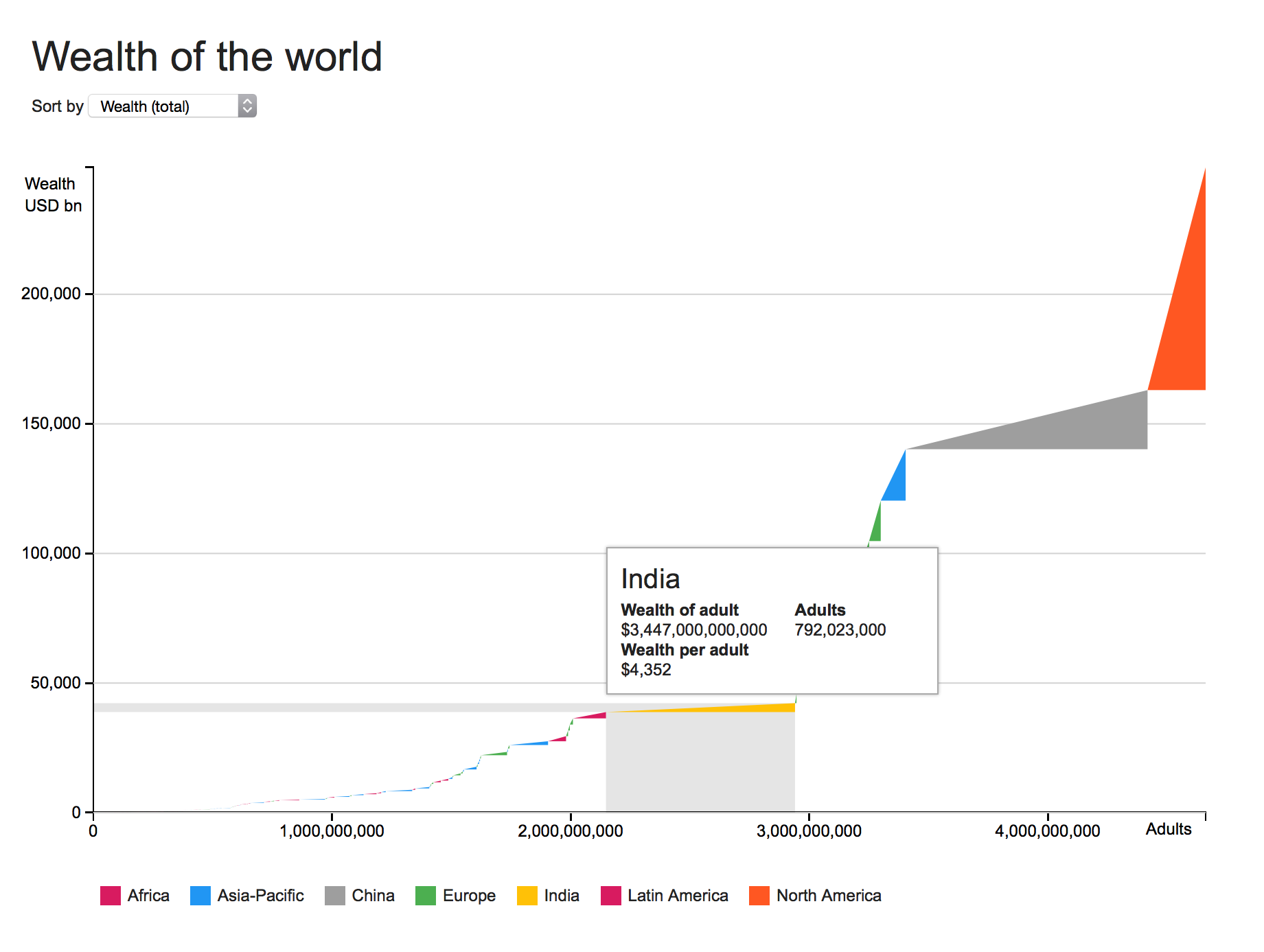
The second chart shows the same information in a different way. It is maybe not the right way to show it, but is helps me to spot some findings. The chart adds up all countries and their adults. Each triangle represents a country and the form of the triangle the relation of wealth and adults. You can see India with a huge amount of adults, but with a smaller wealth than for example Switzerland.
